Xero
UX/UI Design
Prototyping
Information Architecture
A concept project developed in collaboration with Xero's team, with several recommendations adopted ahead of the company's broader rebrand.
The problem
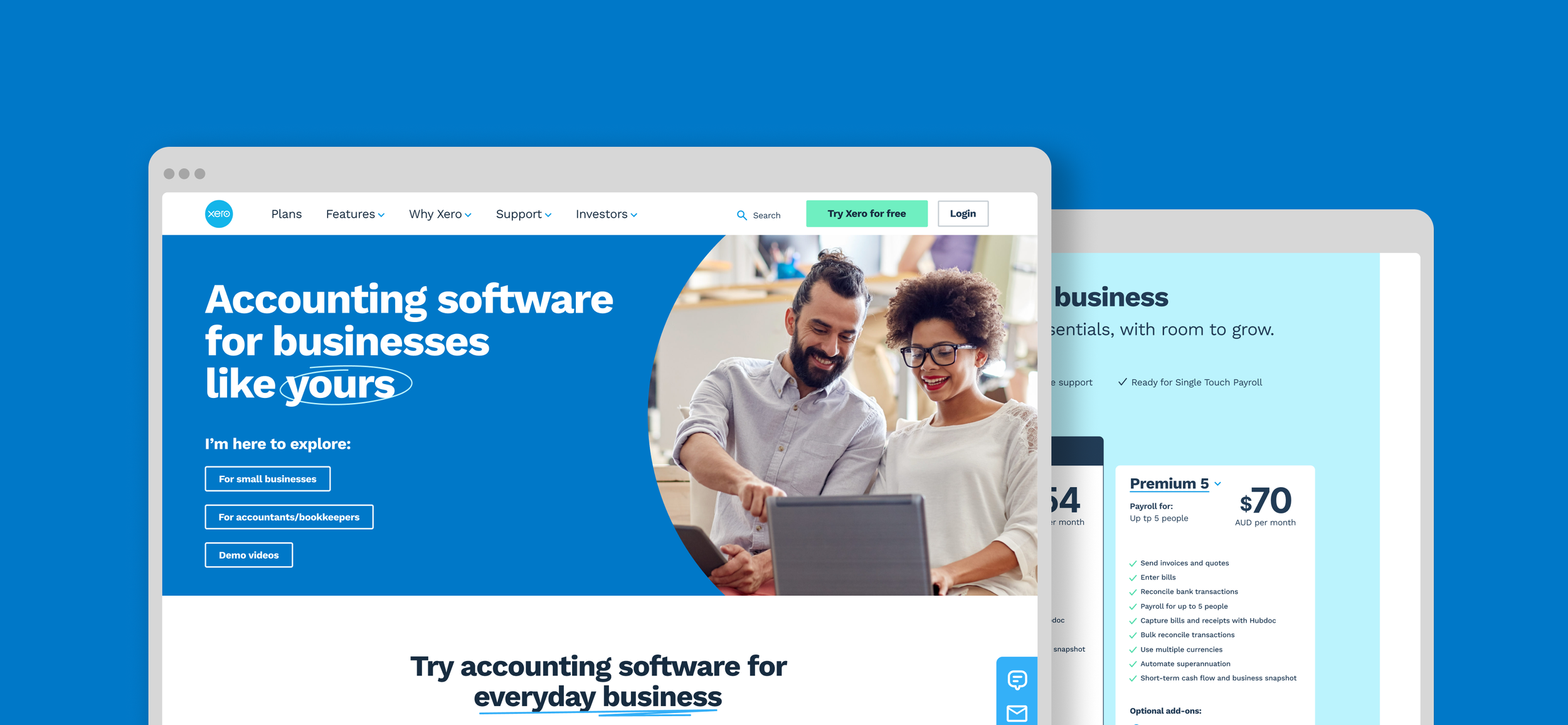
Xero's homepage had evolved reactively over three years of content migration and a template-driven rebuild strategy called 'dotcom reimagined'. With that work nearing completion, an opportunity emerged to take a proper look at the front door, evaluating the user experience with fresh eyes and a mobile-first approach, unconstrained by the technical decisions that had shaped the existing site.
Research
Without access to Xero's internal data or existing research, we built our own evidence base from scratch. We ran competitor analysis and a heuristic evaluation to understand the landscape, then recruited two user cohorts through screening surveys, small business owners and accountants. We ran 1:1 interviews alongside live testing of the existing homepage, which gave us a clear picture of where users were struggling and why. A second round of testing on high-fidelity prototypes followed later in the process, with four participants recruited through Askable.
The research consistently pointed to the same issues: key features were hard to find, the support experience felt inadequate, and users couldn't quickly evaluate whether Xero was right for their business without leaving the homepage.
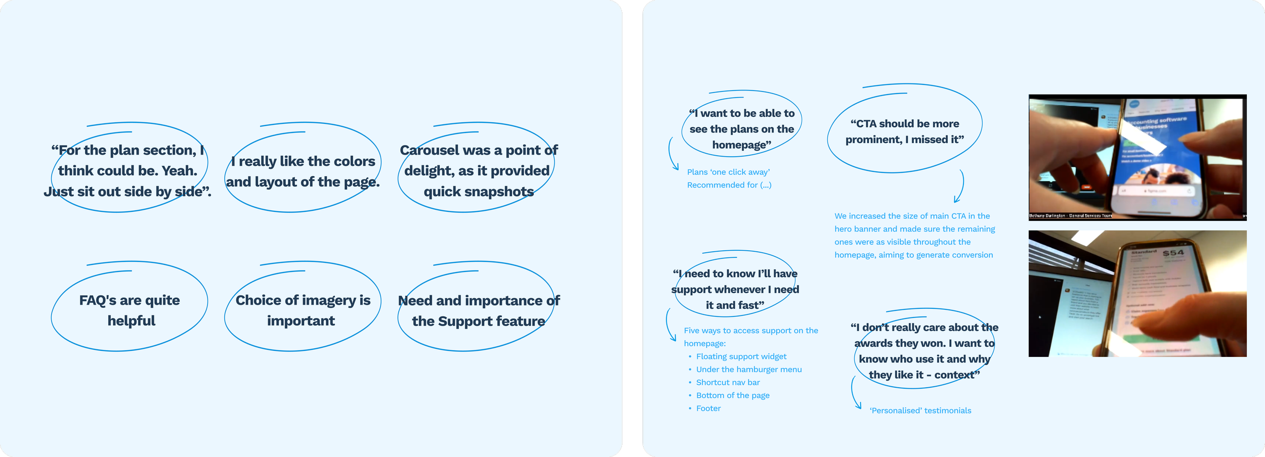
First round of user testing insights and interviews' main insights
Design decisions
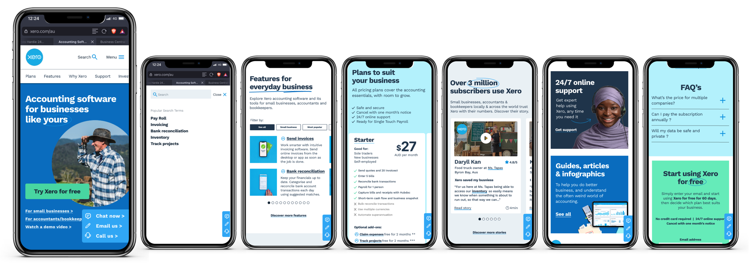
Search bar: Xero has a lot of information on its website so a search bar was included in the header to make easier for users to find the information they were looking for. Reducing the number of clicks to find support was also a key optimisation.
Homepage banner: The height of the banner was reduced so more content was visible above the fold. We also focused on using photography of real people using the product to create relatability for users.
Features: Below the banner, a carousel with a filter function allowed users to filter Xero's features by industry or browse them all at their convenience. We also added a description and a snapshot of each feature to encourage decision making.
Payment plans: The plans were added upfront so users could compare and analyse the options without having to leave the homepage.
Testimonials: We upgraded the testimonials section with more relevant information for users.
Support: This was a big pain point identified during our research and testing sessions. Users want to know they will have the help they need when looking for information and assistance. We included a floating fixed 'support bubble' that on-click would give users the choice to call, email or chat with Xero's representatives.
Footer: The footer was simplified and its sections grouped accordingly in a drop down list.
Recommendations
Trial period Users consistently felt the existing window wasn't long enough to properly evaluate the product, suggesting an opportunity to reduce friction at a key conversion point.
Onboarding support Users wanted more guided help getting started, whether through recommended local accountants or dedicated Xero mentors.
Authentic photography Across all cohorts, stock imagery was quickly identified as inauthentic. Real people in real contexts was flagged as a straightforward way to build trust without changing the underlying experience..
Outcome
The project was developed with weekly check-ins with Xero's team throughout. Several of our recommendations were adopted and implemented ahead of the company's broader rebrand. The project is no longer live following Xero's rebrand, but the collaboration validated that the research and design decisions were directionally right.