frankie Magazine
User testing
UX Research
Information Architecture
The problem
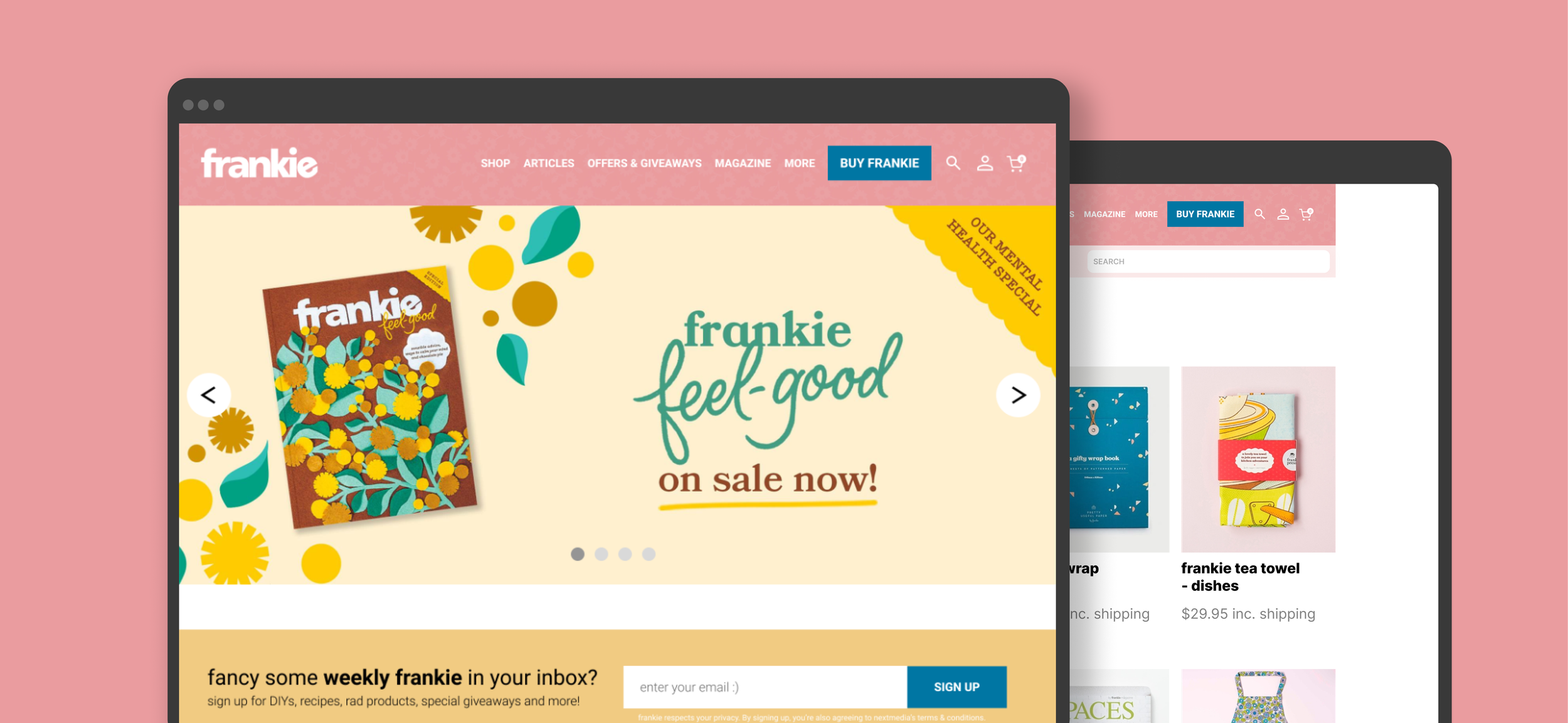
Frankie magazine is a national bi-monthly Australian publication with a distinct personality and a loyal audience. Beyond the magazine itself, the brand includes multiple extensions such as seasonal shop products, special editorial editions, a business club, and a frequently updated blog. The website runs on a custom CMS with daily content uploads and integrates an online shop, which is the business’s primary revenue driver. Most shop traffic comes from mobile, and magazine subscriptions are the hero product.
Despite the shop being the business priority and subscriptions being the key product, the website experience did not clearly or efficiently guide users toward the Shop or subscription purchase journey. Navigation, messaging, and mobile usability created friction between content discovery and commercial conversion, limiting the site’s ability to drive traffic and sales effectively.
My role
I led the research and user testing streams of the project. My focus was the usability of the Shop experience, while other designers concentrated on the homepage. I designed and facilitated two rounds of user testing, synthesised insights, and translated findings into clear recommendations and solution flows. I worked closely with the team to ensure research outcomes directly informed design decisions across navigation, menus, and the purchase journey.
Project Overview
The purpose of the project was to evaluate the website user experience, in regards to shop navigation and purchase journey, as well as general experience on the main home page, specifically focussing on page navigation and menus.
Primary Objectives
1. Explore the most functional and aesthetic opportunity to drive traffic to the shop and encourage purchases (especially for subscriptions)
2. Optimise the main page navigation and tabs (including top header tabs and hamburger menu items)
Secondary Objectives
1. Establish clear messaging on the main site about the current issue and how/where to buy it
Key Deliverables
1. Research insights on the explorations
2. UX solution flows (usability + customer experience of shop and home page navigation)
3. Prototype of the solution
Scope
1. frankie's homepage: overall navigation and menus
2. frankie's shop: shop homepage and product details page only
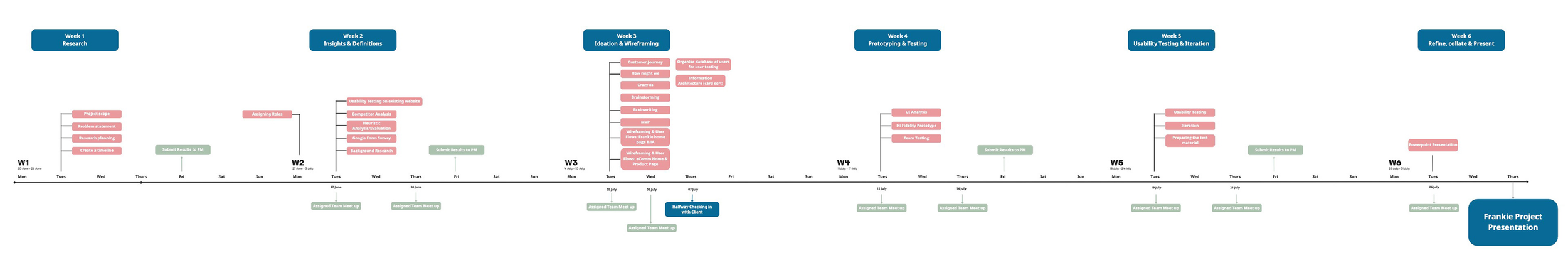
Research and discovery
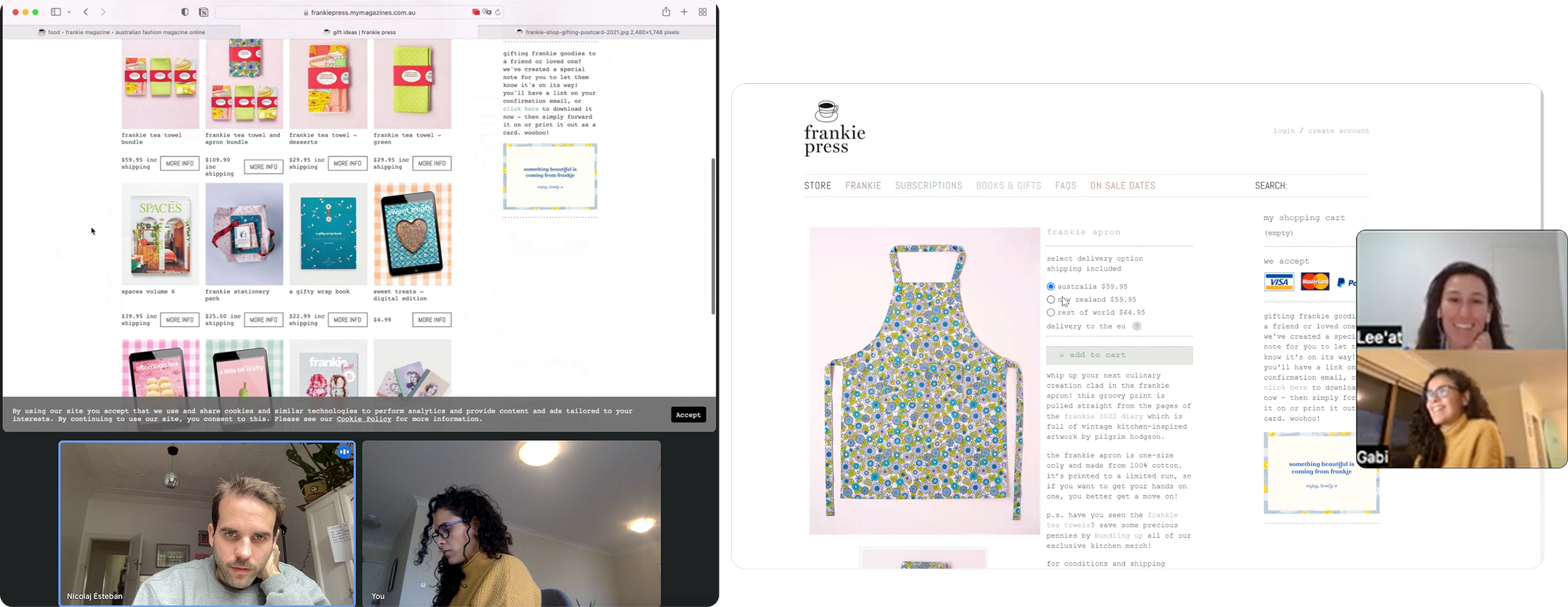
The first 2 weeks of the project were dedicated to discovery. Including background research, competitor analysis, heuristic evaluation and usability testing on frankie's homepage and shop.
Phase 1 - Competitor analysis and heuristic evaluation
• Exploratory research: online and frankie's past research insights (e.g. GA, etc)
• Competitor analysis
• Heuristic evaluation
Phase 2 - Surveys & interviews
Quantitative
• Google form survey with broader audience
• Google form survey with frankie's customers
Qualitative
• 1:1 Homepage user testing x 9 (3 users and 6 non users)
• 1:1 Frankie Shop user testing x 9 (3 users and 6 non users)
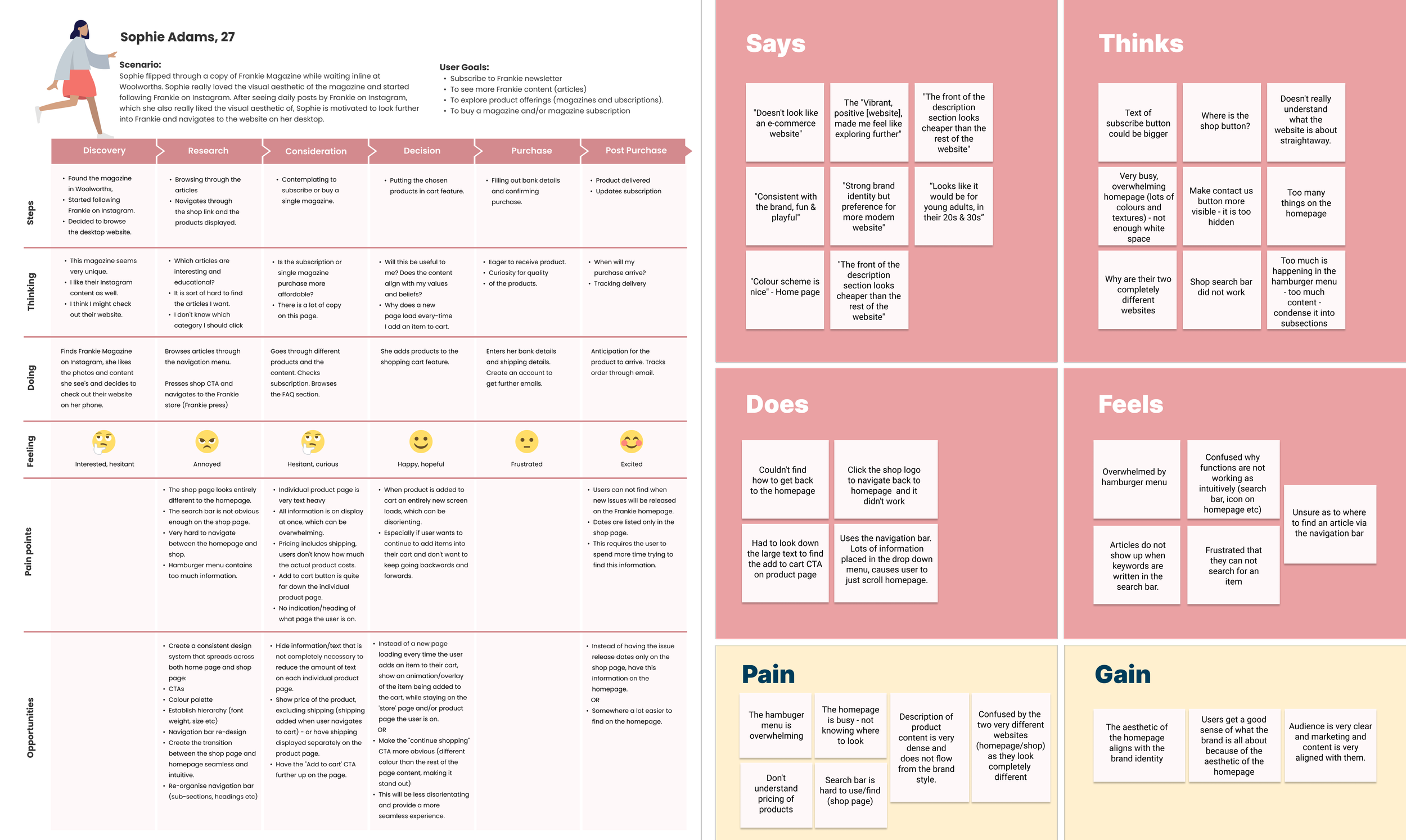
The data gathered from the research with both groups helped us identify the main pain points and areas for improvement.
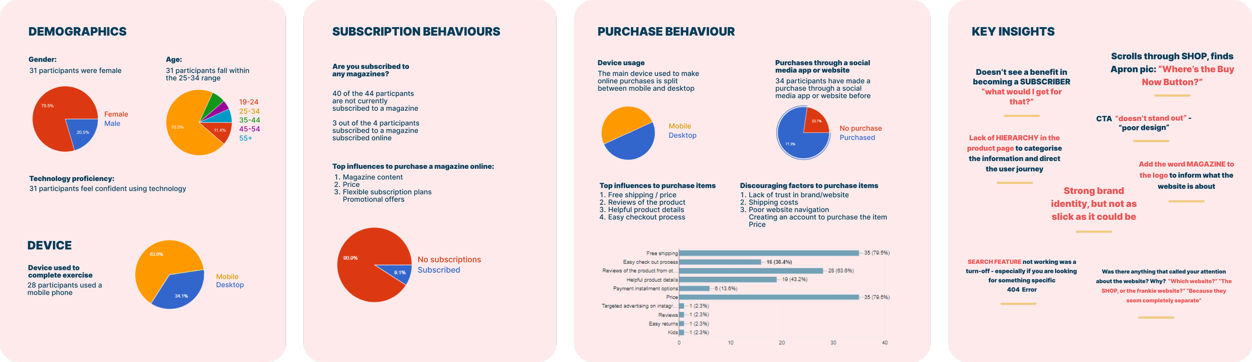
Key insights by category
The development journey
Empathy and customer journey maps were created to synthesise insights from a human centred perspective and to help us understand the interaction and experience users were having navigating frankie's website and shop across various activities.
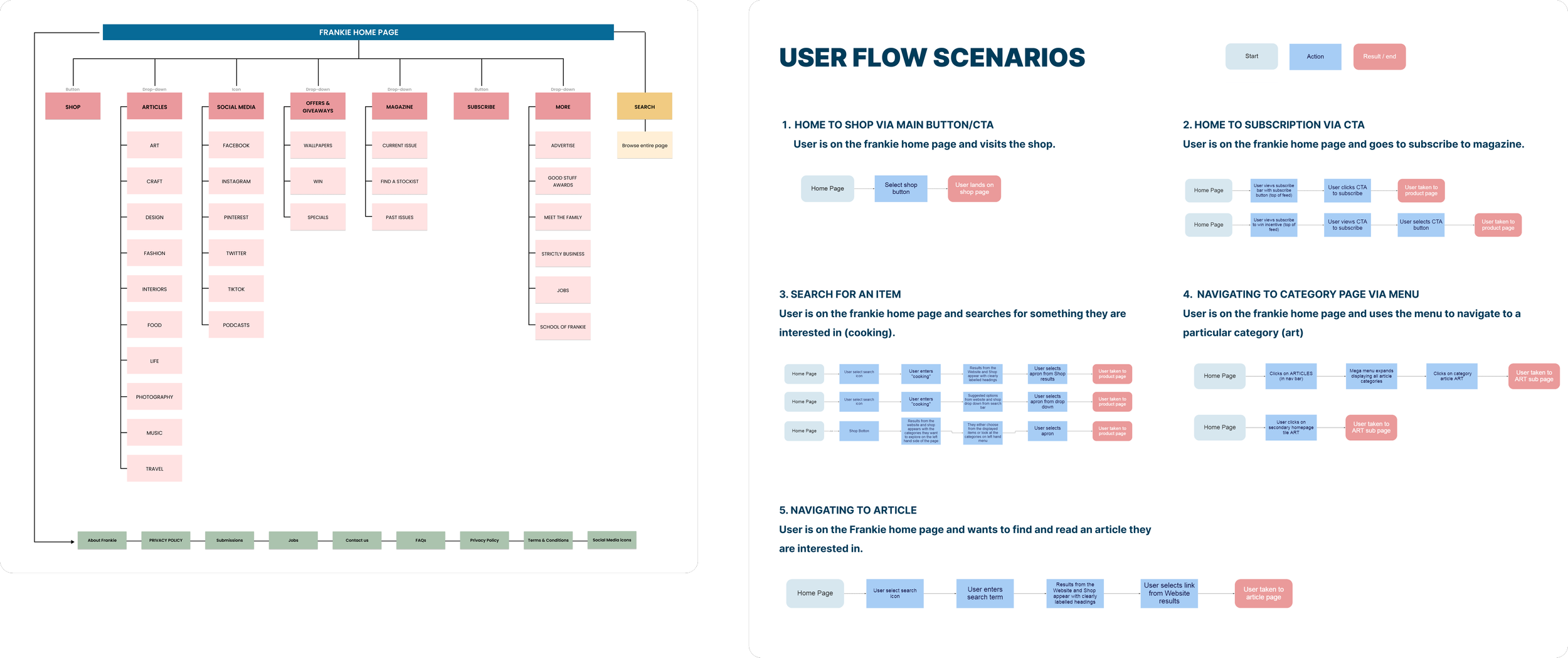
Navigation Strategy & Information Architecture Optimisation
Our findings helped us to improve user flows and navigation for the Shop, including refinements to the shop homepage and product detail pages.
I mapped clearer pathways to subscription purchases and improved wayfinding across key touchpoints. After the research rounds a card sorting exercise was conducted with 10 users to understand how people use the navigation menu and to help us define how the top navigation bar would look like.
From the first round of user testing and the insights collected in the card sorting exercise an opportunity rose to design a more comprehensive navigation plan by grouping categories appropriately. Basic linear user flow scenarios were also drafted to guide us through the process.
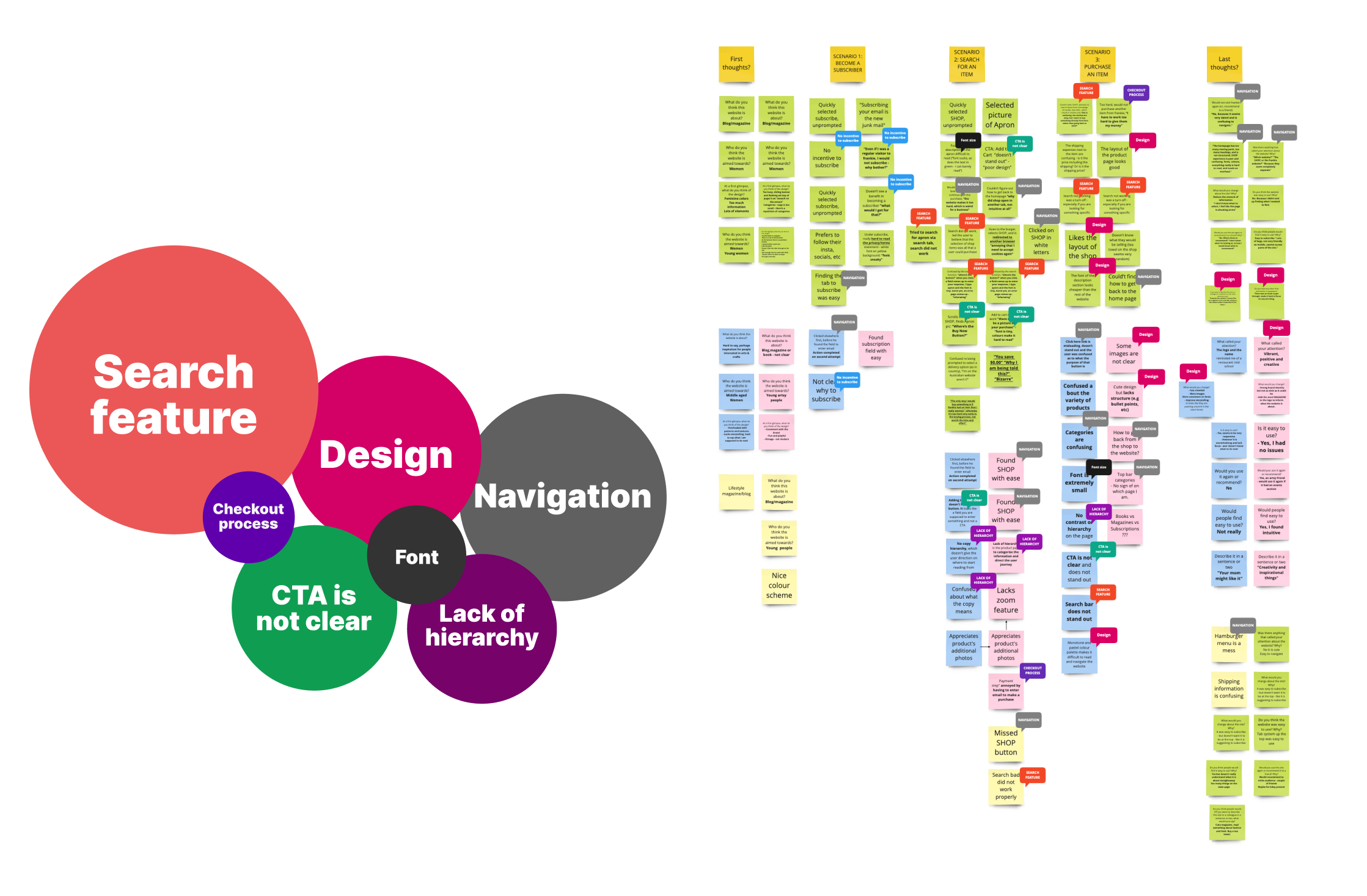
User testing
First round of user testing
The first round of user testing aimed to identify users’ behaviours and main pain points when using Frankies’ website and shop
Second round of user testing and iterationsI conducted six user testing sessions with non users and our goals were:
To understand how well participants can interpret and use the frankie website prototype.
To test whether our designs have solved the problems that were identified during the first user testing session.
To gather feedback on the prototype and implement further changes as needed.
The insights collected on the second round of testing identified iterations had to be made to improve the design.
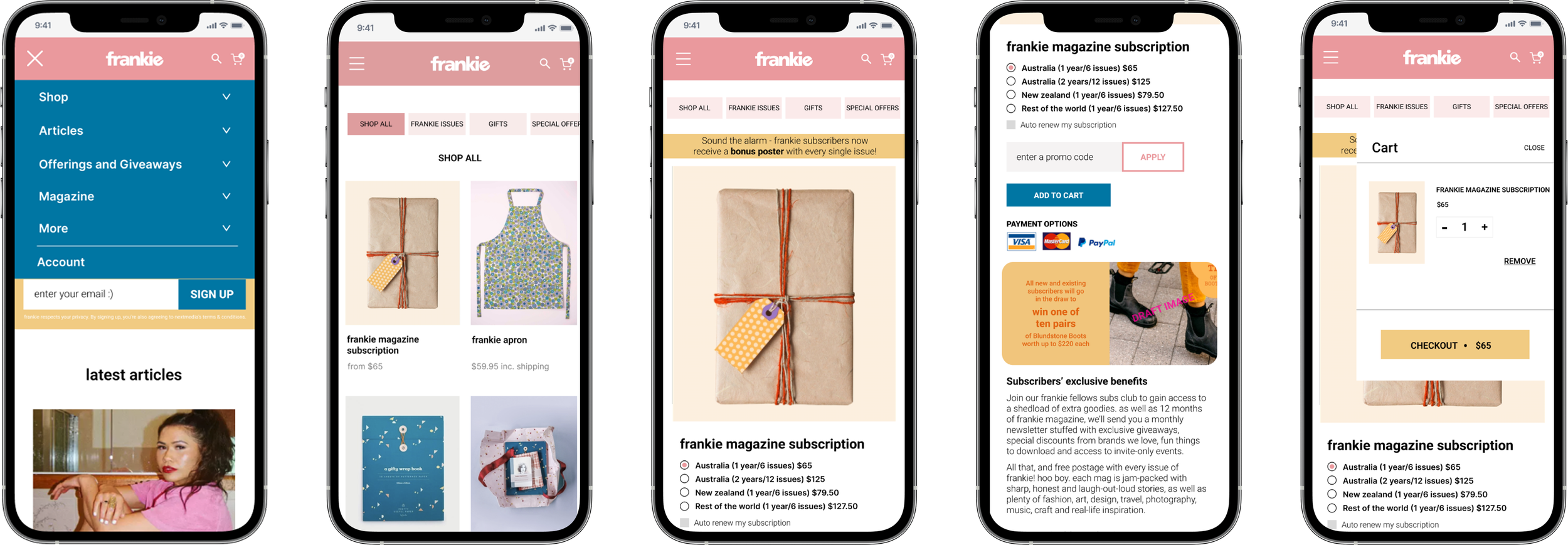
The delivery journey
After the ideation session, wireframes were designed to illustrate the solutions identified in the MVP matrix. As a team, we tested them out and moved towards designing a high fidelity prototype to test among users. In the prototype we focused on improving the user experience on the homepage, specially on the shop.
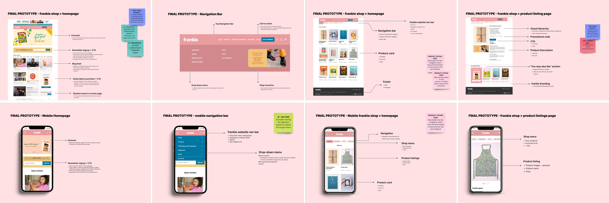
Recommendations
Navigation should be simplified further
Replace or remove the ‘more’ navigation option
Add chevron to shop navigation option and include filter items
Consider incentives to encourage sign up to the newsletter
Add single magazine purchase option to subscription product page so the user only has to visit one page to either purchase a subscription or latest issue
Review ratio of image sizes
Consider more accurate imagery for magazine subscription. For example, a stack of magazines.