KitKat: What’s your jam
Packaging
Illustration
Created a conceptual packaging for KitKat focused on building a stronger emotional connection with consumers.
The approach
By introducing a different design and a musical quality to the packaging the idea was to develop a closer and more personal relationship between the brand and its consumers. Through mass personalisation, the design aims to bring people closer together and give them a sense of belonging by improving their experience when eating chocolate and also by generating a sense of community that shares common interests.
To help support the idea and concept, the points of sale were also designed to communicate the idea to the viewer. That was done by redesigning their display box and suggesting the use of a wobbler for bigger retailers.
How does it work
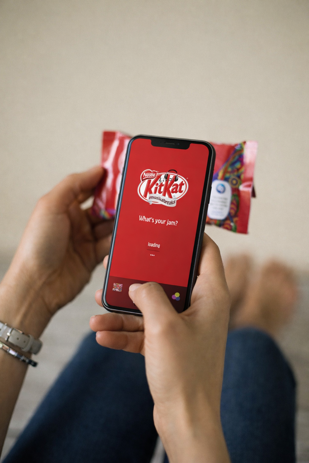
The concept enables consumers to access music by scanning the KitKat packaging, with each pack linked to thousands of songs across a wide range of genres, including rock, hip-hop, psychedelic, jazz, and pop. The experience is designed to be playful and shareable, encouraging participation through the hashtag #musikalbreaks.
This unique hashtag creates a dedicated space where music lovers and KitKat fans can connect and engage within a shared online community.The idea is to make possible to listen to music by scanning a KitKat packaging.
Design specifications:
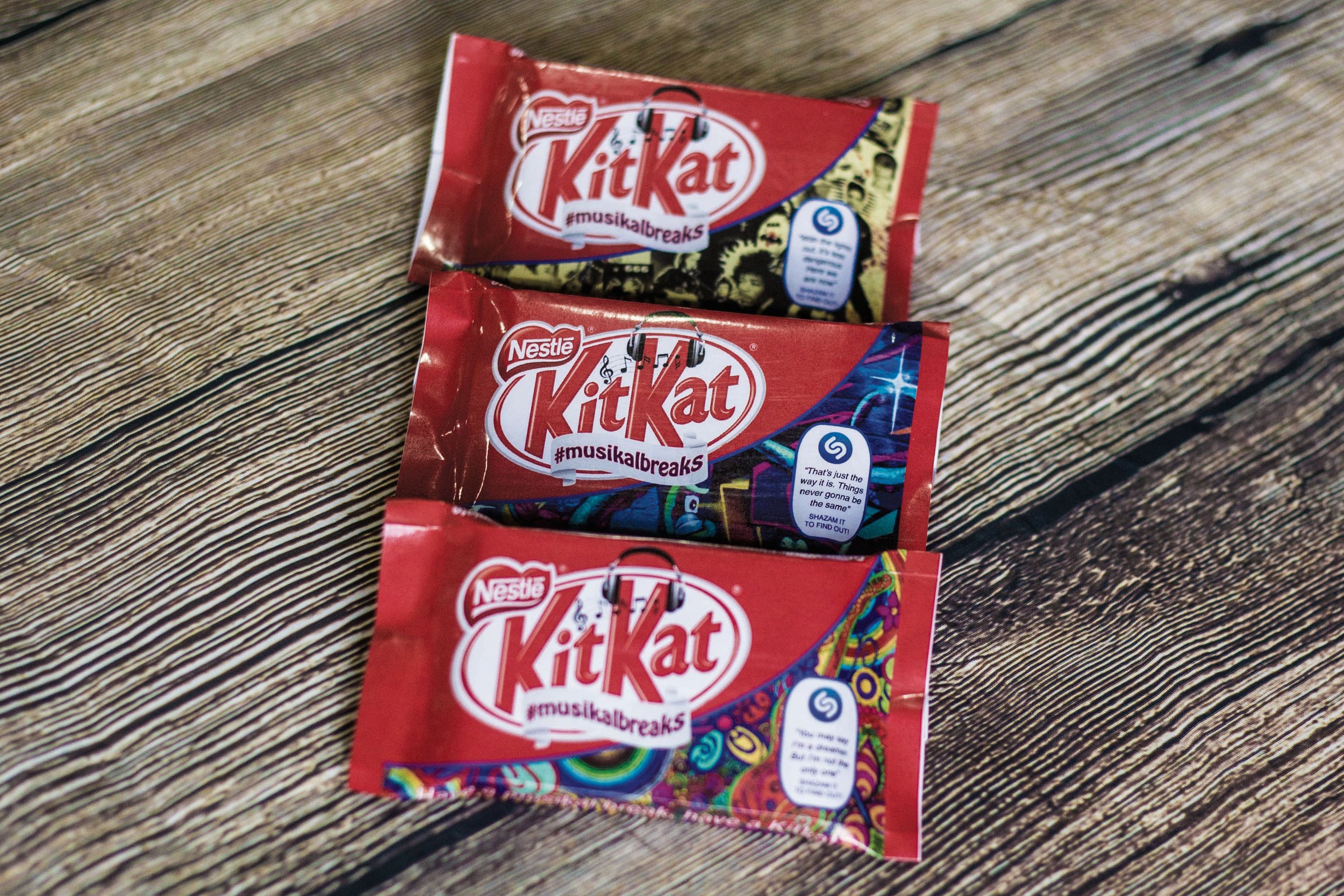
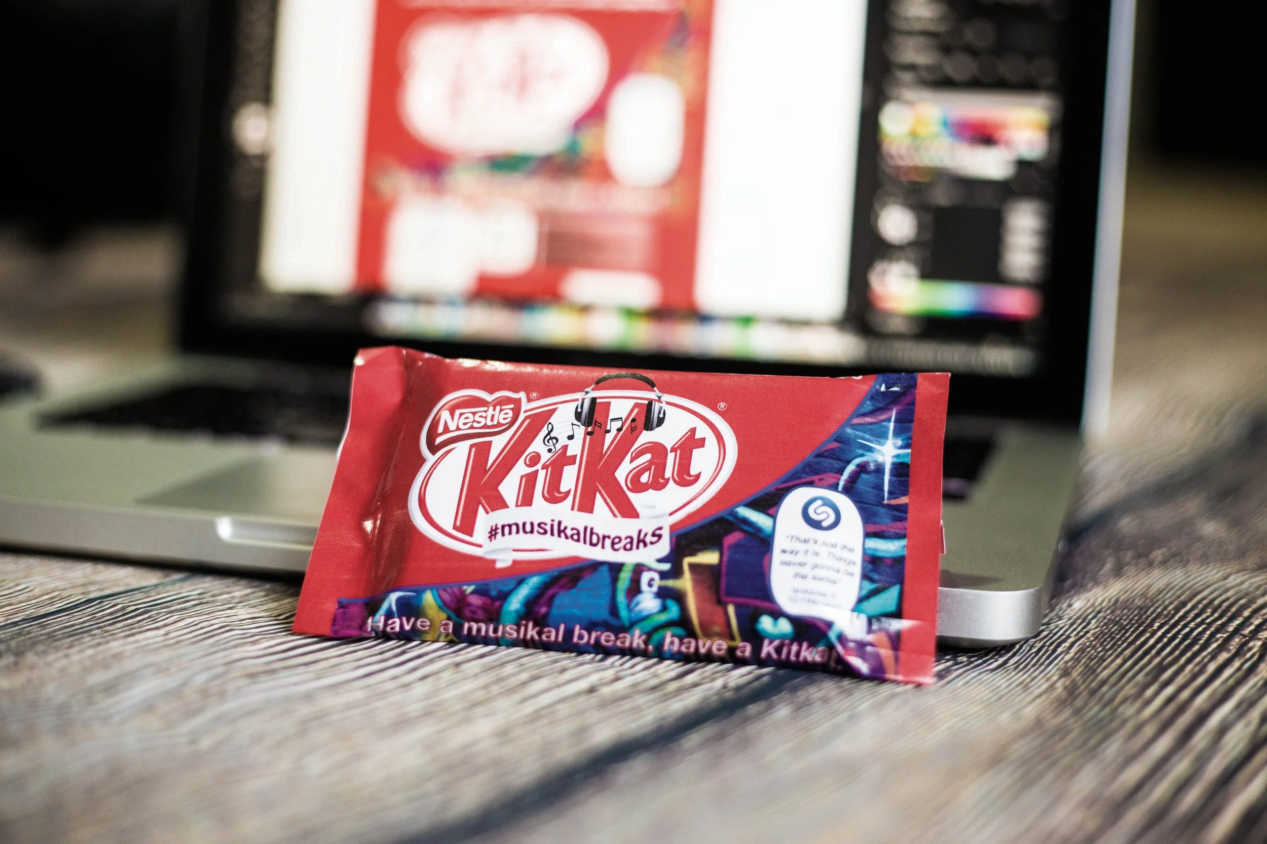
The packaging should retain the same dimensions as the current KitKat 4-finger format. Colour application will evolve with the introduction of a creative pattern as an additional design element. The pack will maintain elements of the brand’s red on the top face and sides, while the remaining surfaces will feature the pattern, visually expressing the specific genre.
The logo
The logo development went through several stages to ensure clarity across the multiple touchpoints integrated into the packaging. The visual mark was designed to communicate the concept immediately, allowing consumers to quickly understand the purpose of the pack.
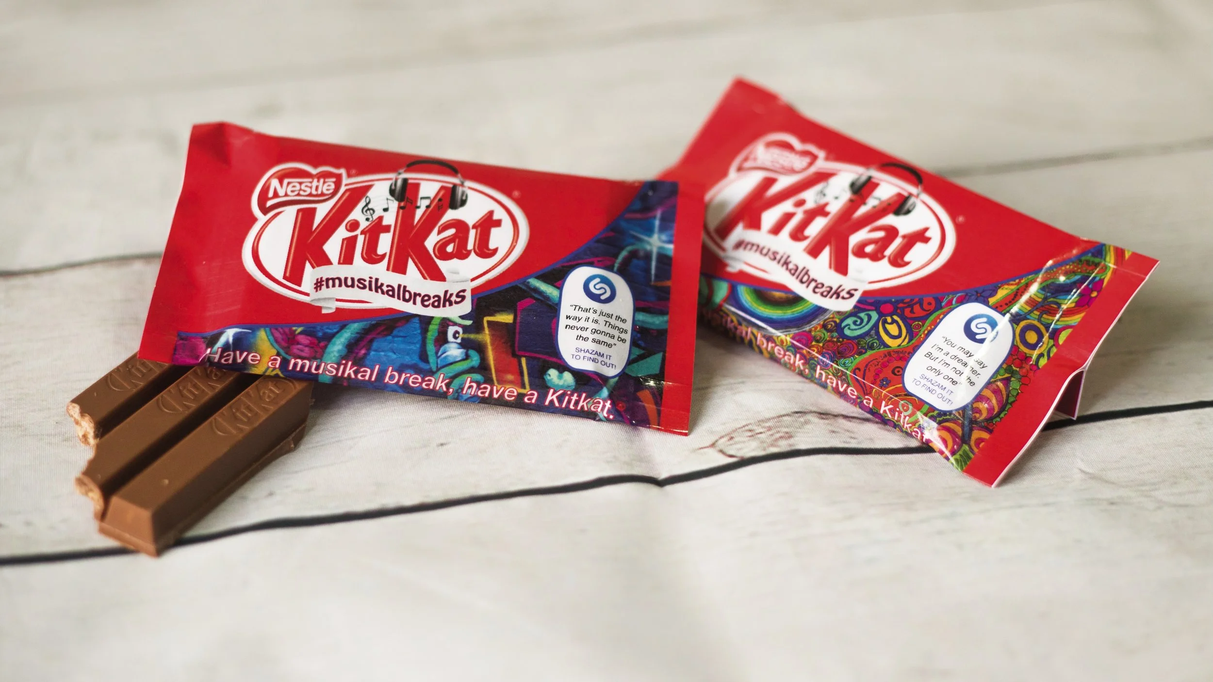
Opening mechanism: Instead of tear off it will have a re-closable pouch to maintain the integrity of the packaging.
Packaging touchpoints
The pattern
A unique print visually hints at the musical genre featured on the pack, turning the design itself into a storytelling device.
The song verse
Including a lyric creates an emotional connection. Reading a verse can trigger memory and nostalgia, encouraging people to mentally complete the song or look it up, extending the interaction beyond the packaging.
#musikalbreaks
The hashtag brings KitKat and music into one shared space. By inviting people to share their experience, it fosters engagement and builds a sense of community around the campaign.
“Musikal” with a K
Spelling “musical” with a K strengthens the association with KitKat, reinforcing brand recall in a playful but intentional way.
Shazam
Using a widely recognised platform like Shazam makes the experience seamless and accessible, bridging the physical pack with the digital interaction.
Experience and journey
After purchasing a KitKat, consumers can scan the Shazam logo on the front of the pack to enjoy their break while listening to music. As a second step, they are encouraged to share the experience using the hashtag #musikalbreaks.
The concept is designed to build connection through a shared interest in music, while fostering a sense of belonging by allowing people to engage with songs from their preferred genres.